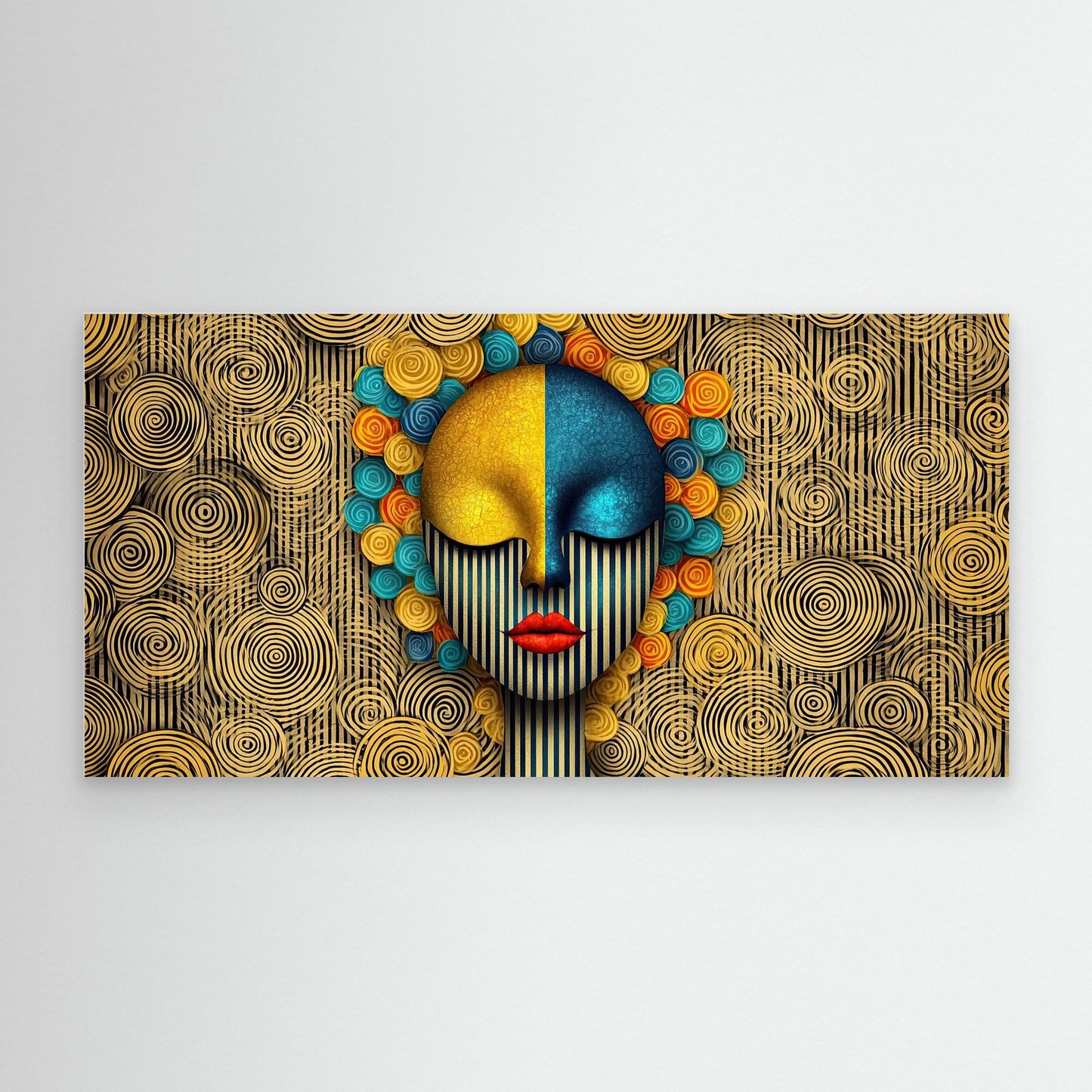
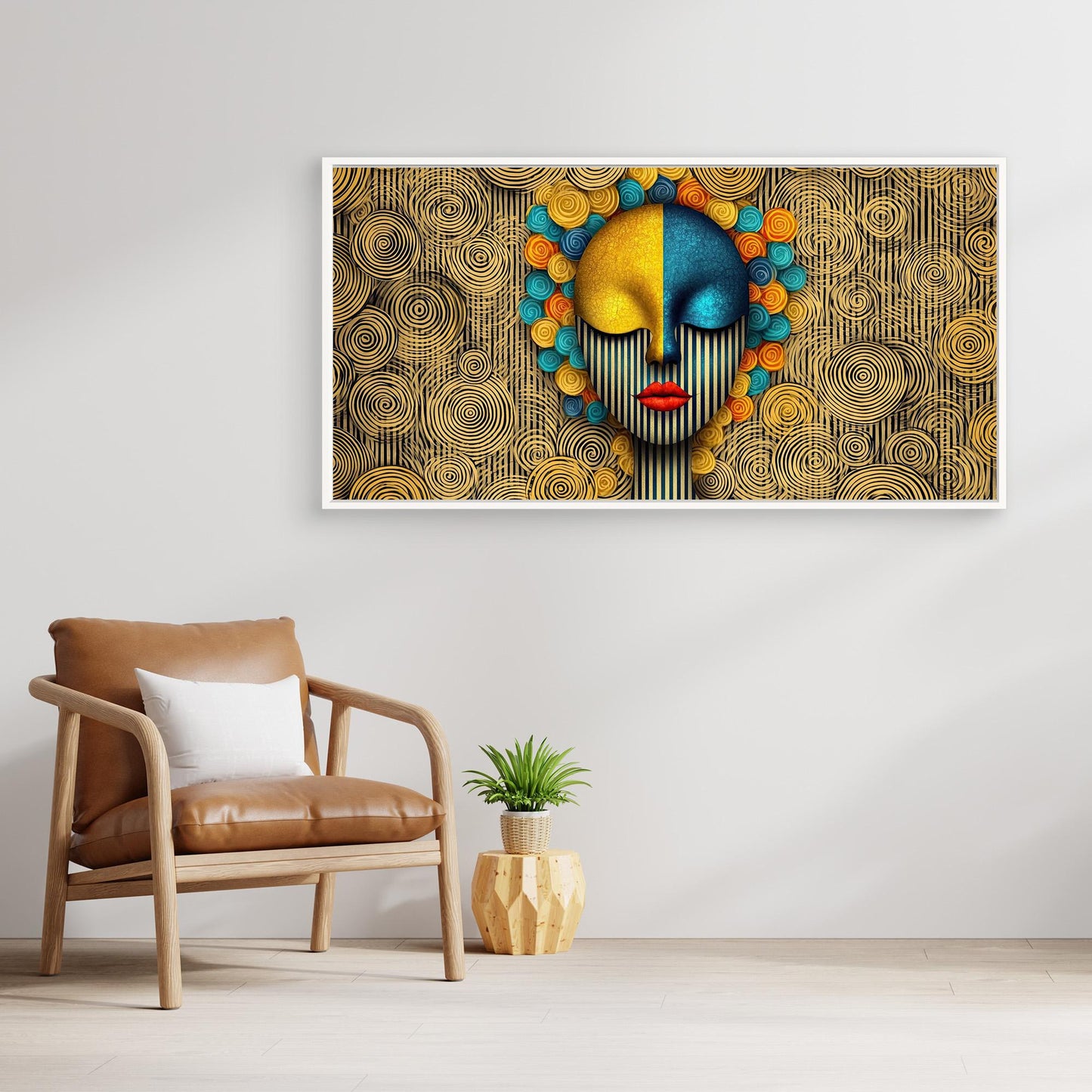
“The Harmony of Opposites” – An artistic representation of balance and diversity
"The Harmony of Opposites" is an impressive work of art that addresses the symbiosis between different elements and the pursuit of inner balance. The strong use of geometric patterns and bold colors combined with the woman's abstract face represents a visual journey between order and chaos.
Description of the artwork:
Central elements:
The face: The portrait of the woman is divided into two halves - one side in golden yellow and the other in cool blue. This representation represents the inner conflict and balance between different aspects of the personality.
Striped pattern: Vertical stripes across the face symbolize the inner conflicts that often arise in an ordered world, while also conveying a sense of structure and discipline.
The flowers: The colorful, spiral-shaped flowers on the woman's head bring an organic, living element to the picture. They represent the creative side of people, which blooms in its freedom and diversity.
Color design:
Warm tones (yellow and orange): These colors radiate energy and optimism, which is associated with joy of life and creative power.
Cool tones (blue and turquoise): These colors symbolize calm, clarity and the power of reflection.
Black and white: The contrasting lines and spirals in the background represent the play of structure between chaos, order and creativity.
Interpretation and meaning:
The Face: A representation of the duality in the human being, which is constantly moving between different forces, from discipline to creativity.
The flowers: They embody the creative power that emerges from the chaos of the world and can lead to a harmonious unity.
Geometric patterns: The stripe pattern and the spirals show how the different aspects of life can be brought into harmony by finding the balance between order and freedom.
Art style and influences:
Geometric Abstraction: The artwork uses clean lines and shapes to convey a modern yet profound meaning.
Pop Art and Surrealism: With its surreal depiction of the woman and the intense colors, the work is reminiscent of pop cultural styles that played with surrealist elements.
Symbolism: The colors and shapes used have a symbolic meaning that indicates the different emotional and mental states that humans experience in their journey through life.
Possible uses:
Modern Exhibitions: Ideal for art galleries and exhibitions that explore themes such as identity, creativity and the balance between opposites.
Creative workspaces: An inspiring work of art for spaces where creativity and structure coexist.
Minimalist style living spaces: A visual enhancement to any modern interior, bringing a touch of energy and meaning to the room.
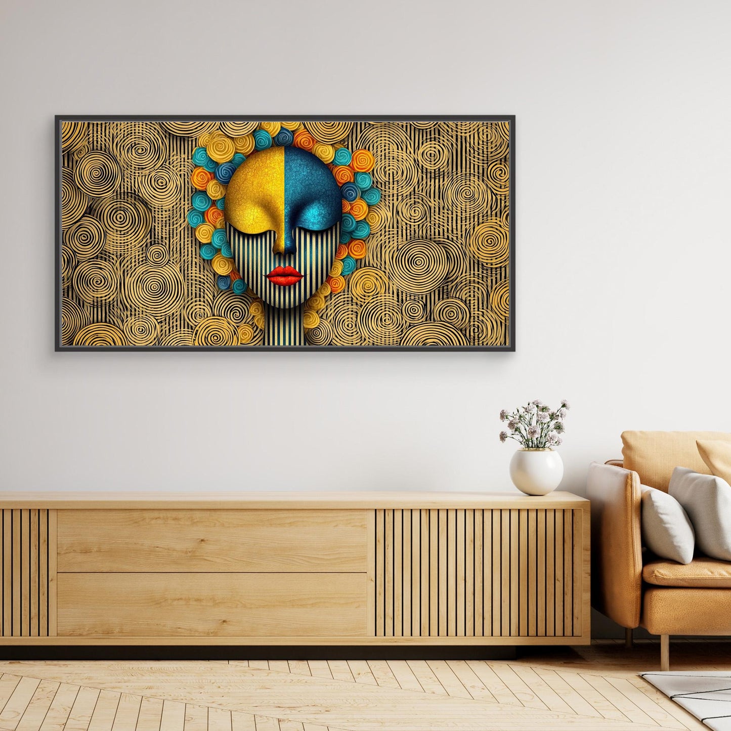
"The Harmony of Opposites" is more than just a painting - it is a reflection on the different forces in our lives and their ability to exist together in a harmonious balance. This artwork challenges the viewer to recognize the complexity of human experience and to find beauty in the balance between chaos and order. "The Harmony of Opposites" - An artistic representation of balance and diversity
"The Harmony of Opposites" is an impressive work of art that addresses the symbiosis between different elements and the pursuit of inner balance. The strong use of geometric patterns and bold colors combined with the woman's abstract face represents a visual journey between order and chaos.
Description of the artwork:
Central elements:
The face: The portrait of the woman is divided into two halves - one side in golden yellow and the other in cool blue. This representation represents the inner conflict and balance between different aspects of the personality.
Striped pattern: Vertical stripes across the face symbolize the inner conflicts that often arise in an ordered world, while also conveying a sense of structure and discipline.
The flowers: The colorful, spiral-shaped flowers on the woman's head bring an organic, living element to the picture. They represent the creative side of people, which blooms in its freedom and diversity.
Color design:
Warm tones (yellow and orange): These colors radiate energy and optimism, which is associated with joy of life and creative power.
Cool tones (blue and turquoise): These colors symbolize calm, clarity and the power of reflection.
Black and white: The contrasting lines and spirals in the background represent the play of structure between chaos, order and creativity.
Interpretation and meaning:
The Face: A representation of the duality in the human being, which is constantly moving between different forces, from discipline to creativity.
The flowers: They embody the creative power that emerges from the chaos of the world and can lead to a harmonious unity.
Geometric patterns: The stripe pattern and the spirals show how the different aspects of life can be brought into harmony by finding the balance between order and freedom.
Art style and influences:
Geometric Abstraction: The artwork uses clean lines and shapes to convey a modern yet profound meaning.
Pop Art and Surrealism: With its surreal depiction of the woman and the intense colors, the work is reminiscent of pop cultural styles that played with surrealist elements.
Symbolism: The colors and shapes used have a symbolic meaning that indicates the different emotional and mental states that humans experience in their journey through life.
Possible uses:
Modern Exhibitions: Ideal for art galleries and exhibitions that explore themes such as identity, creativity and the balance between opposites.
Creative workspaces: An inspiring work of art for spaces where creativity and structure coexist.
Minimalist style living spaces: A visual enhancement to any modern interior, bringing a touch of energy and meaning to the room.
"The Harmony of Opposites" is more than just a painting - it is a reflection on the different forces in our lives and their ability to exist together in a harmonious balance. This artwork challenges the viewer to recognize the complexity of the human experience and to find beauty in the balance between chaos and order.
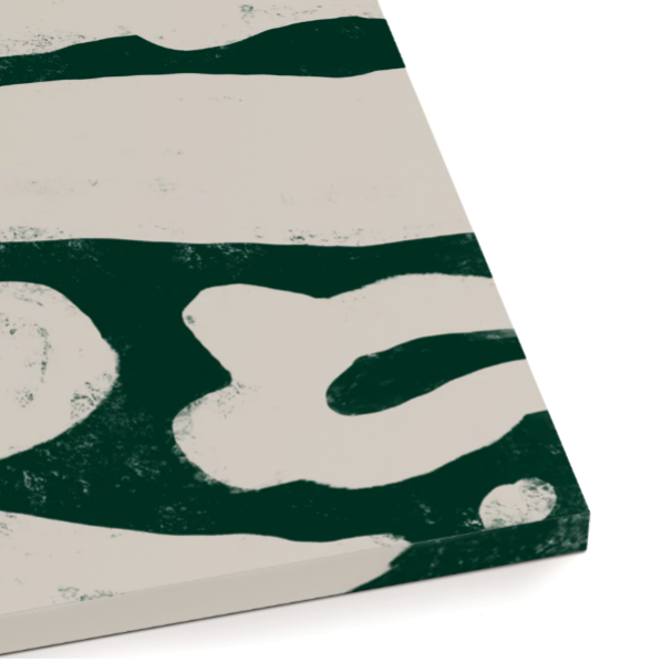
Our canvas prints are crafted with high-quality materials to ensure long-lasting durability and vibrant colors. With customizable size options and various frame styles, each piece is manufactured to the highest standards, ensuring your artwork has a premium finish. Our canvas is 344 gsm and 17.5 mil thick.
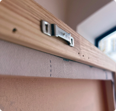
Ready to hang
Each print comes with pre-attached sawtooth hangers and rubber bumpers to protect your wall and keep your artwork perfectly aligned.
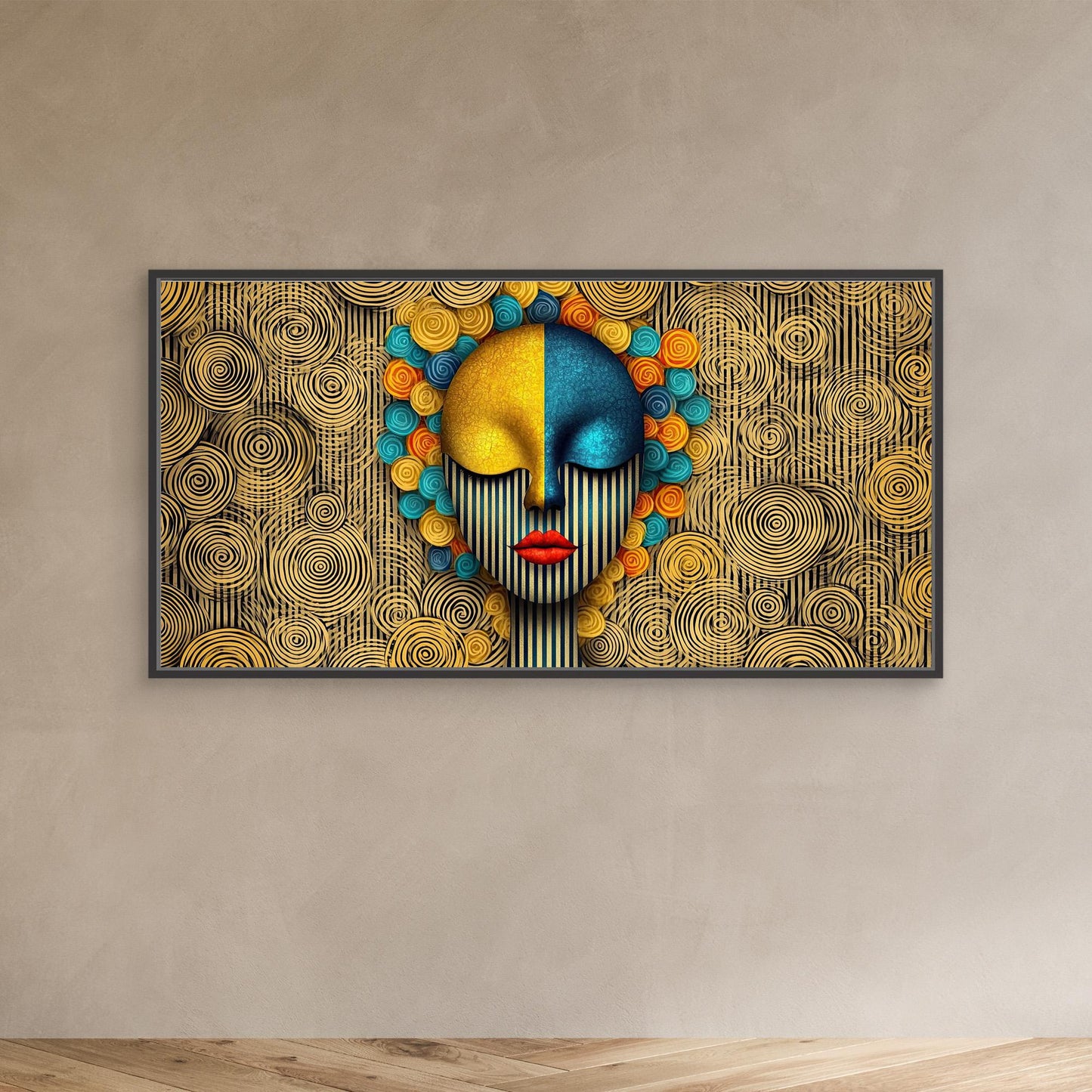
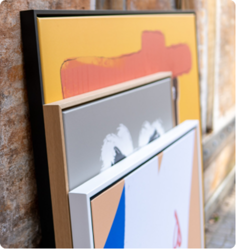
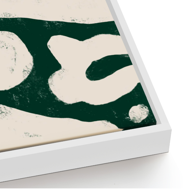
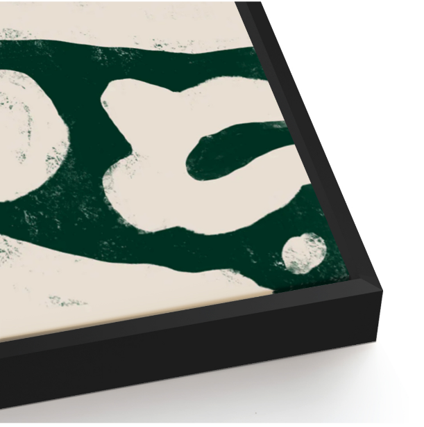
framing
Our floater frames are made from poplar wood and give your canvas the appearance of floating within the frame. The frame is 1cm (0.4") wide at the front and 4cm (1.6") deep at the side. The frames are available in black, white and oak to suit any artwork.
Without frame
white frame
Black frame
Subscribe to our emails
Be the first to know about new collections and exclusive offers.
Choosing a selection results in a full page refresh.